Make a payment
Payment initiation for startups in JPMorgan’s new banking experience
Ring One is a new bank by JPMorganChase for startups, aimed to scale with its clients as they grow in size. Our workstream designed how users pay people and companies, aiming to build something fresh, intuitive, and flexible.
Design led by Ann Tran, supported by Darren Gainza
Product co-led by Jermaine McDaniel and Dawn Mitchell
Tech led by Milan Shah
How we stack next to our competitors
While the research team finds users to interview, we took the extra time as an opportunity to dive into what our payment competitors were up to. Building off of others, we could think about how to impact our customers beyond what’s already happening in fintech.
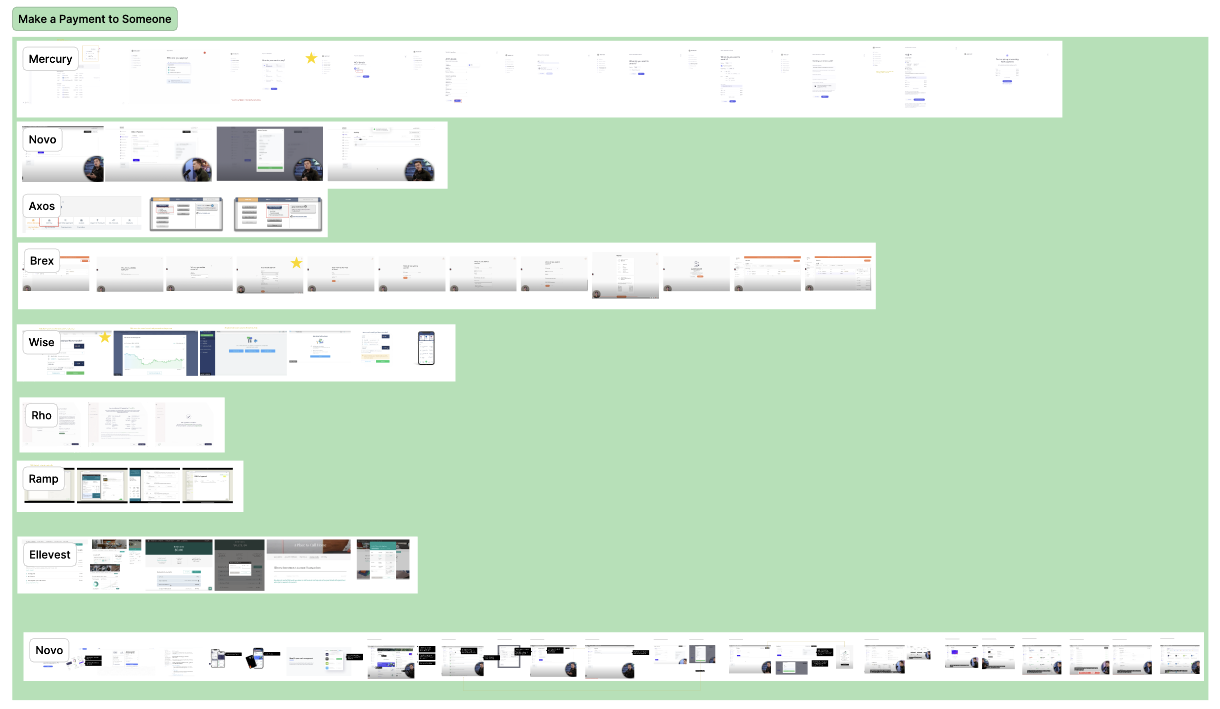
We did so by capturing the payment initiation flow across our competitors.
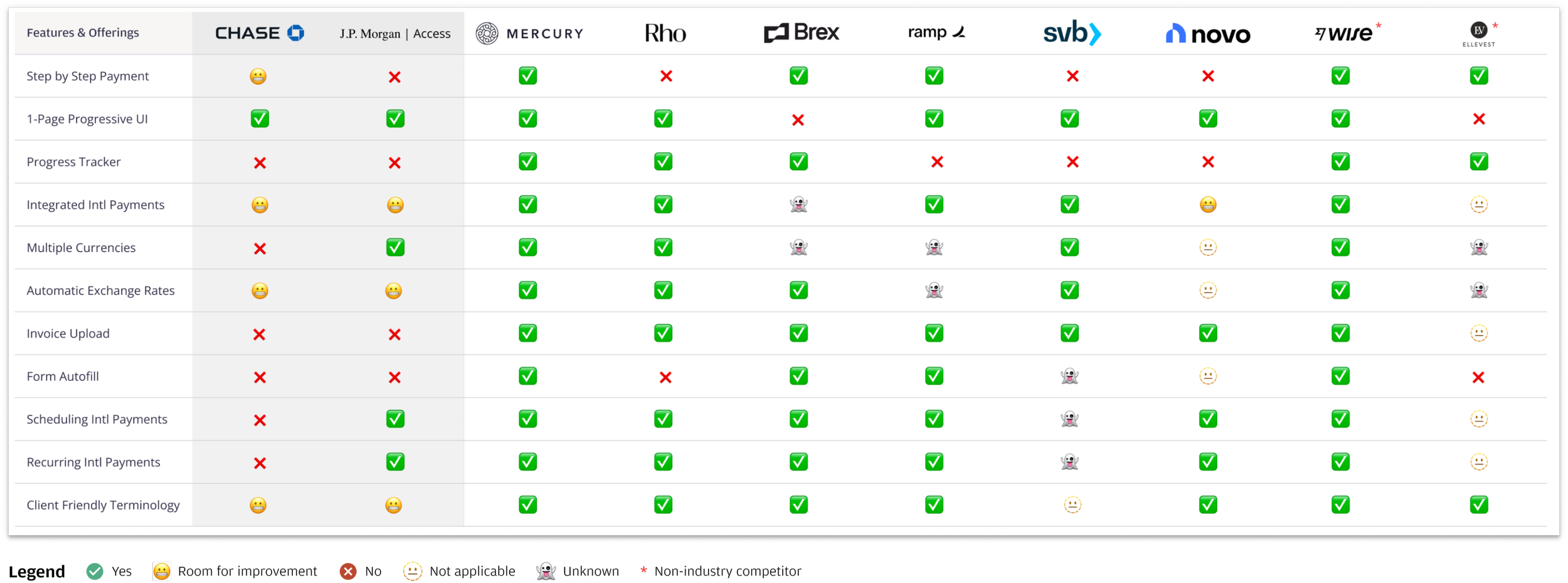
I then led the initiative to assemble information into a matrix to more easily compare features. For each row, we pulled key examples to illustrate the through line of how companies understood the user’s needs and preferences.
The most prominent theme that emerged was that our competitors had deceptively simple payments flows, making it easy for anyone to create and complete a payment.
They understood not only the questions users asked themselves along the way, but also the order which they may want to answer so that users could fill necessary fields as quickly as possible.
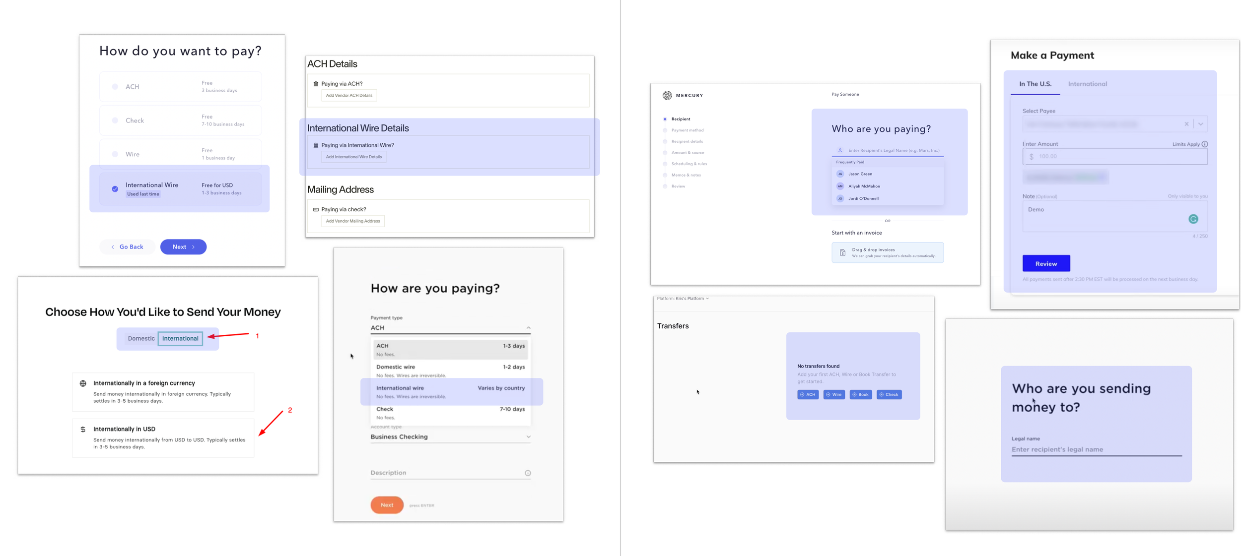
Below are two examples of similarities in competitor flows (seen in Mercury, Brex, and Ramp). On the left, competitors’ international and domestic payments branch from the same starting point because users’ first train of thought is commonly how they wish to pay. On the right, competitors display steps one at a time to reduce cognitive load and to streamline thinking.
Building bridges
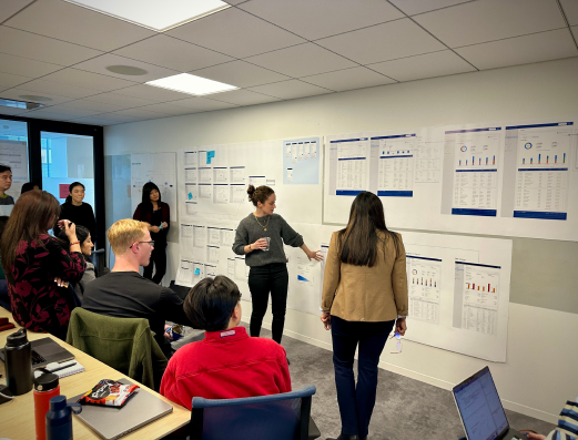
A recent merger with First Republic Bank brought in a brand-new product squad. The design team organized a two-day workshop in New York at the launch of the project together to align key use cases, user flows, journeys, and ways of working for now and beyond. Workshop topics focused on accounts, reports, money movement, and dashboard.
One activity I was in charge of designing was first separating into three groups with product, design, and engineering in every group. Then, we asked each group to build their ideal payment flow.
The key takeaway was that all the groups’ flows had a step-by-step progression that narrowed the user’s task at hand, keeping field input minimal. The activity set the tone for what we all wanted out of the payment experience because many team members came from legacy systems that displayed all field inputs front and center.
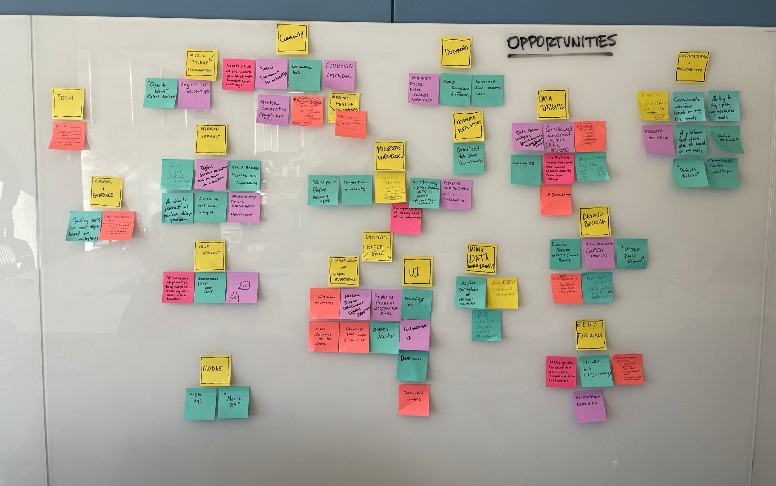
This was a great segue to then think about our future value propositions to clients. Opportunities could be to help founders build community, find new avenues for funding, and more.
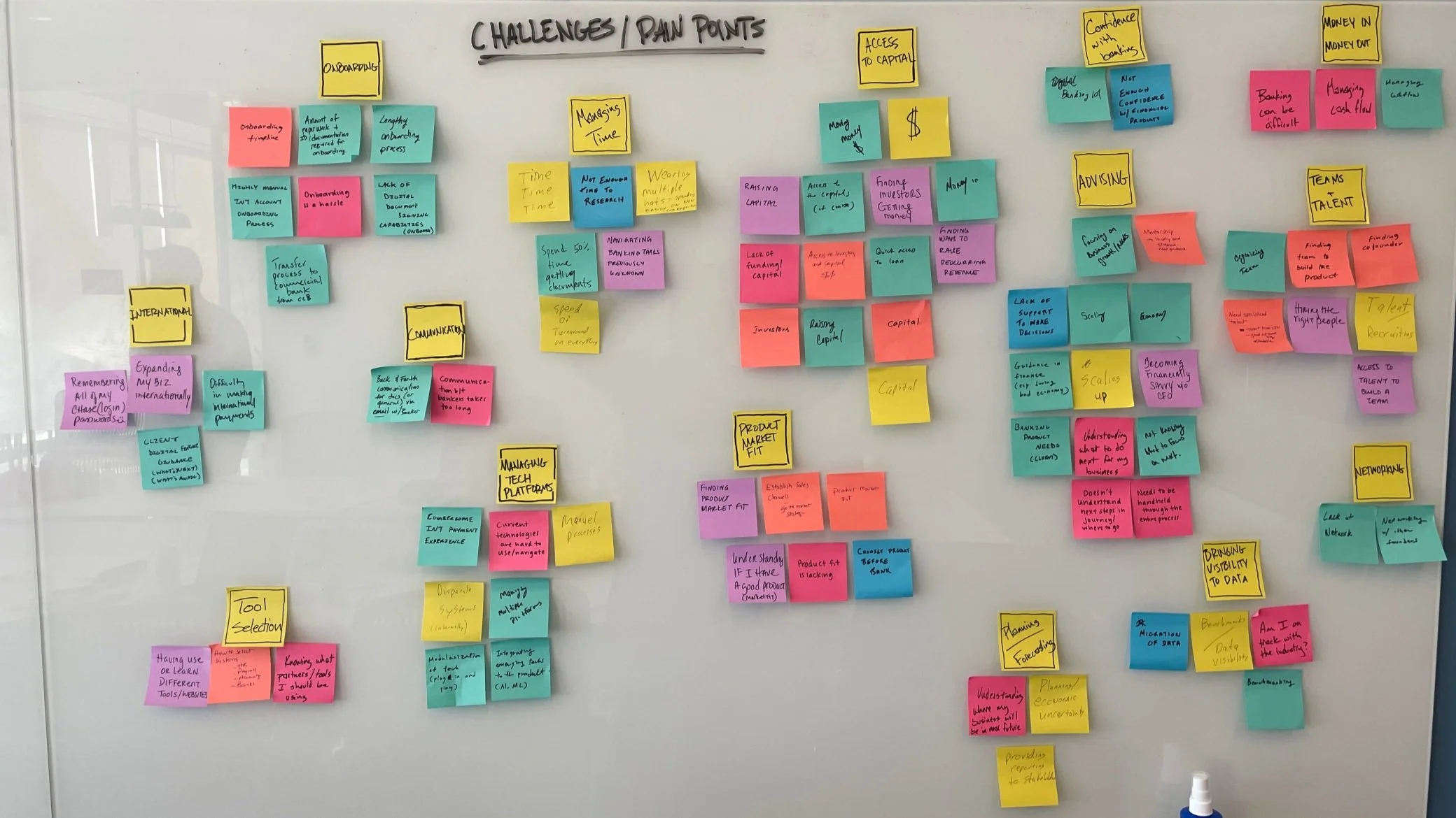
We also brainstormed on challenges that clients might face, from determining their product’s market fit, to lack of mentorship or advisory.
Simple, streamlined task-doing
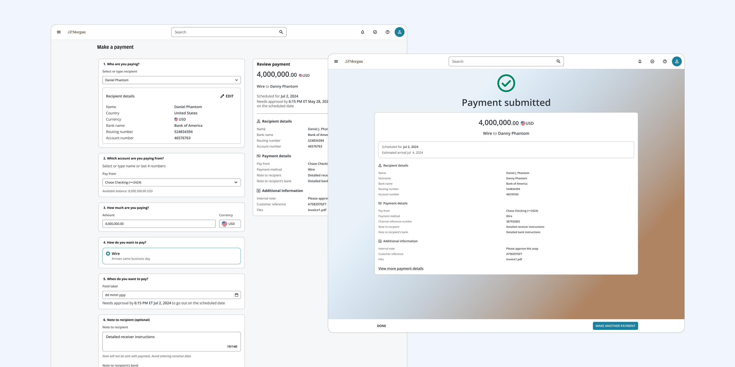
Below is the legacy experience for making a payment and what we transformed it into.
Originally, dozens of fields would display at a time. The reason is that some complex clients need to include a lot of field values when paying vendors and recipients. However, it is an eyesore for our simpler startup clients and might even intimidate new users, especially those who are just getting started running a business. They often don’t even know what most of the fields mean (we didn’t even know for a while!).
In our new experience, our designs capture the minimal fields for founders to make a payment without losing the ability to scale up complexity.
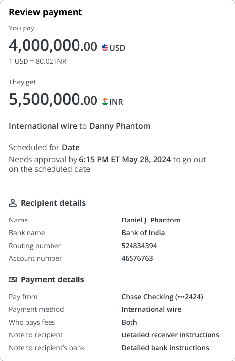
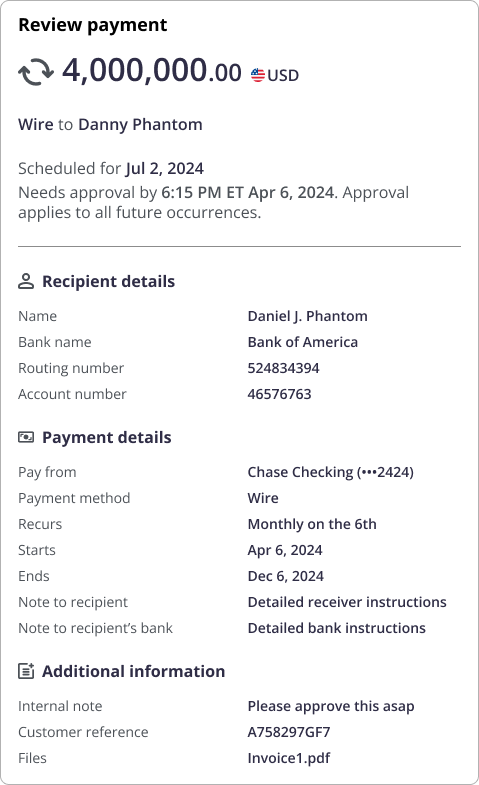
First, we applied our research to design a progressive display of information that’s simpler than our legacy experience, but retains next step headers for users to preview what they had left to fill in. Secondly, as a big bank, we serve the full range of different business types and always need to consider big and small corporations’ needs in tandem. To do so, we use information containers in the form of cards as modular blocks. Future designers can easily add or modify the blocks to accommodate for different payment needs. Finally, on the right-hand side, we have a preview of the confirmation page, which I’ll explain more in the next section, that dynamically updates to show the user’s choice-making.
Just like adding to your online cart
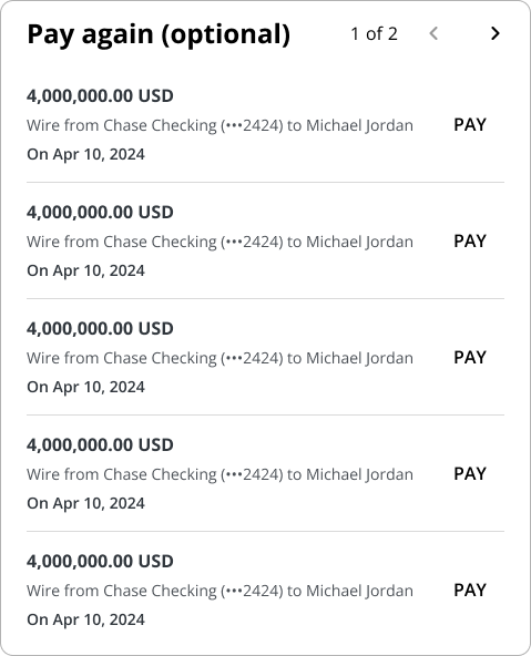
In our research, we were inspired by e-commerce’s shopping cart interface. Retail companies (e.g., Wayfair, Amazon, Target) have a concise order summary that reflect the receipt of purchase prior to confirming. As payments get more complex, there will be an even greater need to recap payment details.
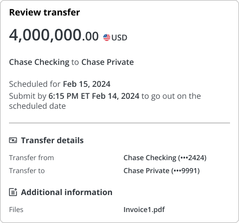
Below are some examples of how we’ve modified the summary card for new product requirements. From left to right is a quick way to pay users again; international wires; internal account-to-account transfers; and recurring payment series.
Outcomes and learnings
Our official launch to friends and family will be for Fall 2025, but we did conduct research interviews with ten participants most recently.
The design team stitched together their respective flows for the dashboard, payment activity, and making payments into a single prototype. We then shared the link for participants to click through themselves. With the research team, we conducted 1-hour long unmoderated feedback and usability testing sessions, taking notes on user feedback as they navigated through it.
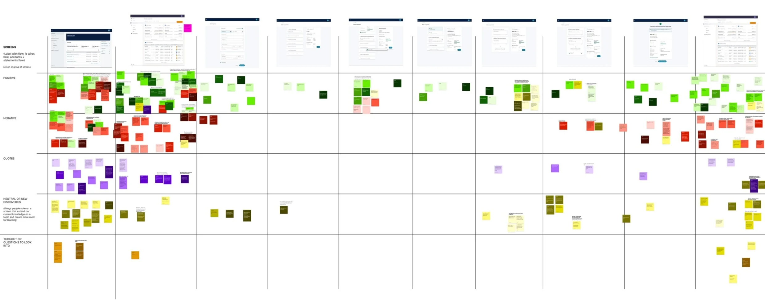
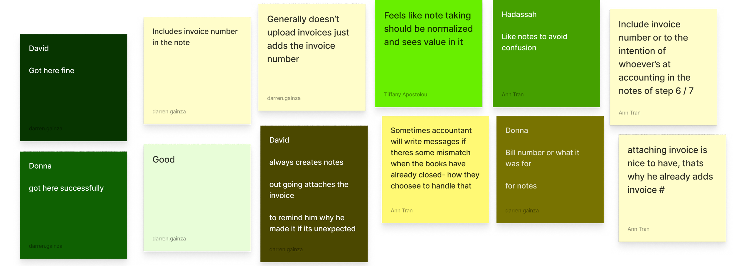
Here is a more detailed view of some captured feedback on adding notes to payments, color coded by user names.
Post-session, we condensed participant feedback into categories: key takeaways, need to improve, surprises, quotes, and what worked.
For making payments, which is what Darren and I were responsible for, 9 of the 10 participant felt that the flow was easy to follow and effective, finding the review card surprising but helpful.
“I think it’s really easy. What I would like to see more that isn’t here, and I think that’s just by virtue of this being in a banking platform and not a separate dedicated software.”
“This is something I could pick up; you know have no problem or would expect any staff member to be able to do seamlessly right away.”
