Approve payments
Helping startups action on payments that need approval
Ring One is a new bank by JPMorganChase for startups, aimed to scale with its clients as they grow in size. In addition to making payments, companies often need to ‘approve’ submitted payments before they can be scheduled to send. We worked on what that might look and feel like, iterating off of feedback along the way.
Design led by Ann Tran, supported by Emma Wang and Yash Hemmady
Product led by Jermaine McDaniel, supported by Koshon Williams and Zeeshan Khan
Tech led by Avinash Indirabai
Mapping entry points
First, we needed to decide where it’d be intuitive to approve payments. The obvious answer is wherever they’d want to.
As a general usability principle, we wanted to provide openness and flexibility, allowing users to do whatever they want whenever they want. That being said, creating multiple entry points to the flow can mean more complicated menus and information architecture that add clutter and get people lost.
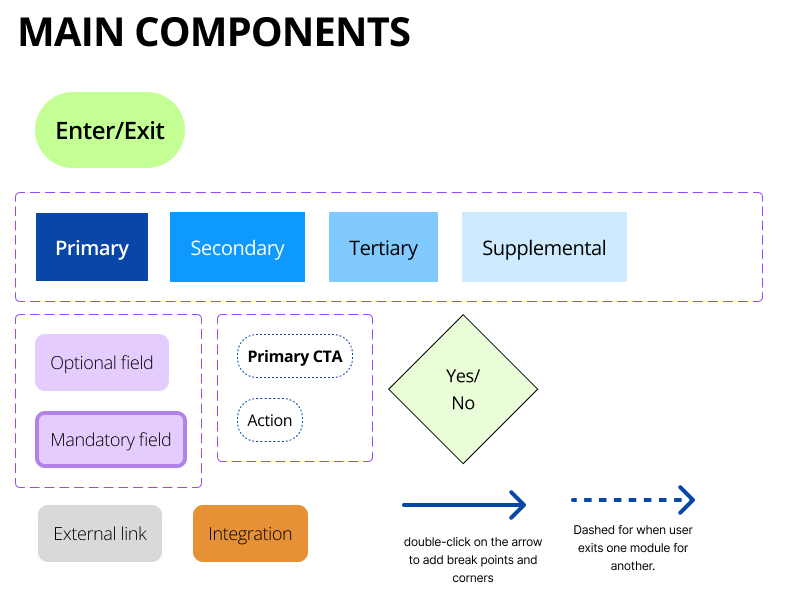
To make sure we had a clear idea of how users could get where, the researcher Tiffany and I worked together to map out every location a user could approve a payment.
One location that made sense to approve payments from is within the money movement landing page. There lived a few widgets where users could either directly approve the payment or navigate them somewhere that they’d be able to as a follow-up action.
Another location users might want to approve payments is in the activity page, which displays recent and upcoming digital payments and transfers.
Our final flow was for the Action Items’ full page and widget, which users would expect to house all types of platform approvals.
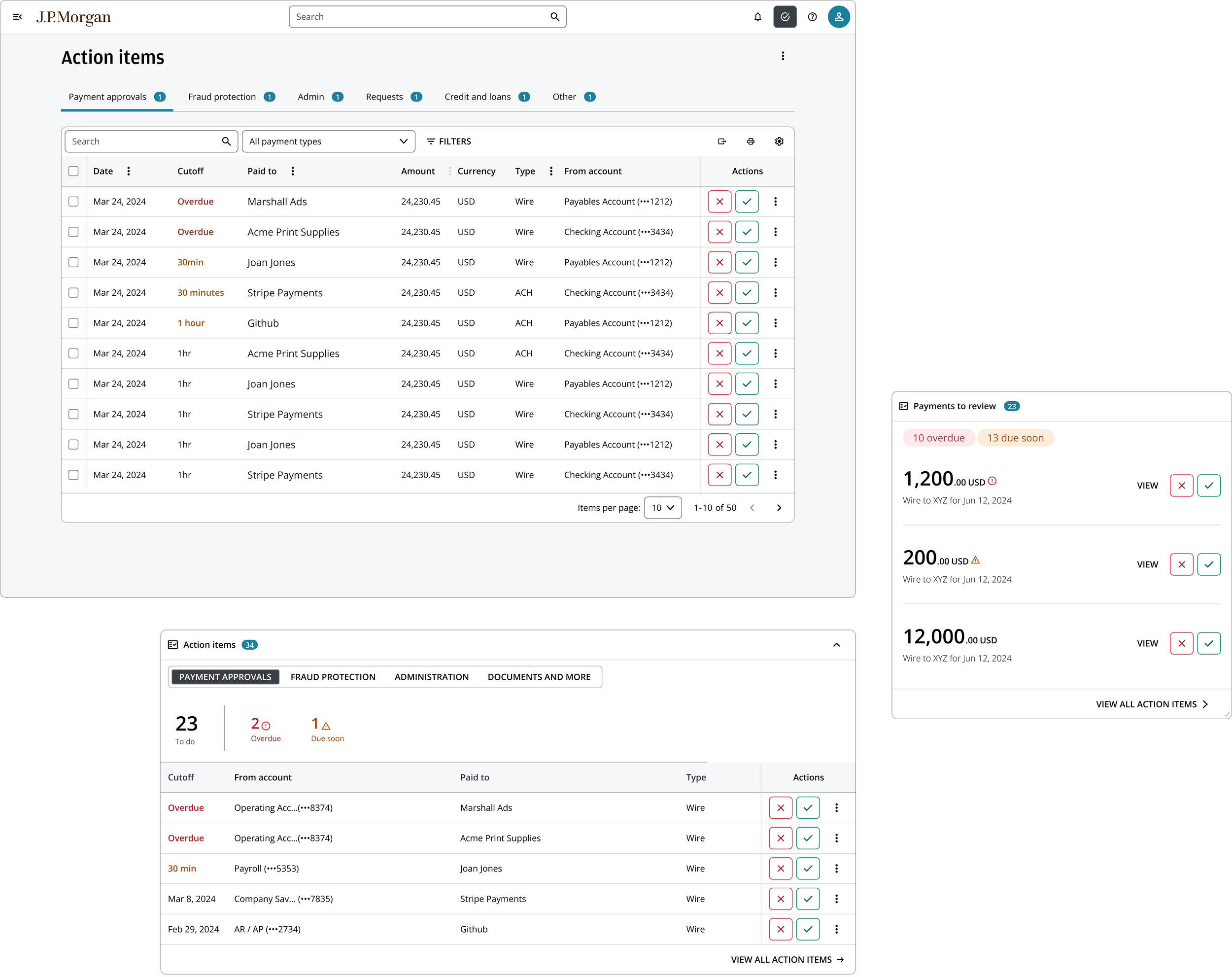
Below are Action Items screens and widgets I designed that show various approval entry points.
Top left is a dataview of payment approvals in the Action Items page. We collaborated across work streams to ensure consistency because the design system’s pattern had yet to be published. We aligned on tab order, column order, type treatment, button treatment, export flow, and more. The bottom left widget is for Ring’s home page, where the team had to similarly align design across work streams, from column order, to header metrics and more. Finally, the right-hand design for a widget that could live either in the home page or the money movement landing page. It is tailored for users to efficiently approve the most urgent payments. We wanted to show users what they needed first with the option of clicking in for further detail.
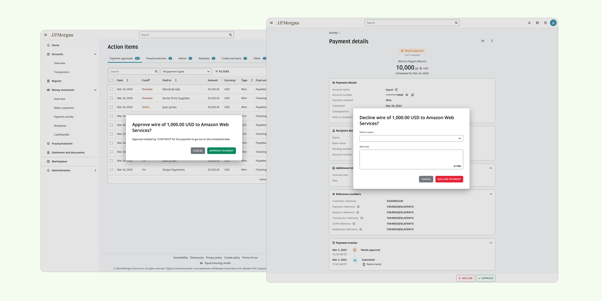
These next screens display payment details in full page and recurring payment series in drawer view. As you can see, there are entry points into the approval flow consistent with Action Items. Information containers are easily added or modified as product requirements expand. Information hierarchy is ordered vertically with most important details to the user first.
'Send back for changes’…?
One product requirement we received was that an approver could perform the following actions on a payment pending review: ‘Approve’, ‘Decline’, and ‘Send back for changes’.
The design team questioned the need for both ‘Decline’ and ‘Send back for changes’ as actions. ‘Send back for changes’ and ‘Decline’ are similar because a reason is already required by users when declining. However, the benefit of ‘sending back’ a payment would be that users wouldn’t have to recreate a payment from scratch, but rather edit the existing template. Ultimately, we agreed to take it to research to ground our perspective.
We conducted hour long interviews with six startup founders on the mobile app experience. Company sizes ranged from two to 50 plus employees. Industries included AI, EV charging, news aggregation, financial services, robotics, and biotech. Approving payments through the mobile dashboard was one of the activities tested.
The payment initiation flow was well received overall, particularly ‘Approve’ and ‘Decline’ statuses. However, ‘Send back’ was only understood by two of the six users. If there had been room to include the entire title ‘Send back for changes’, there may have been more clarity for users, desktop research performed with with similar results.
“I don’t know what that is. Send back to who? The utility company? They are not going to permit you to argue with them...”
“I don’t know what that would do and I’d be nervous to press it. I want to know what’s going to happen when I press this - will it send out an email or something else?”
“Why does a send back option exist? Can’t it just be in the decline where you can add a comment?”
We took this as an opportunity to revisit our design and implement feedback of simplifying the approval flow. We proposed this to our stakeholders and they agreed it made sense to remove it. One revision we made to the architecture was adding the ability to edit and re-submit a declined payment so users could make changes within the created template and users would have the ‘Declined’ event in the payment’s tracking history.
Overlap between workstreams
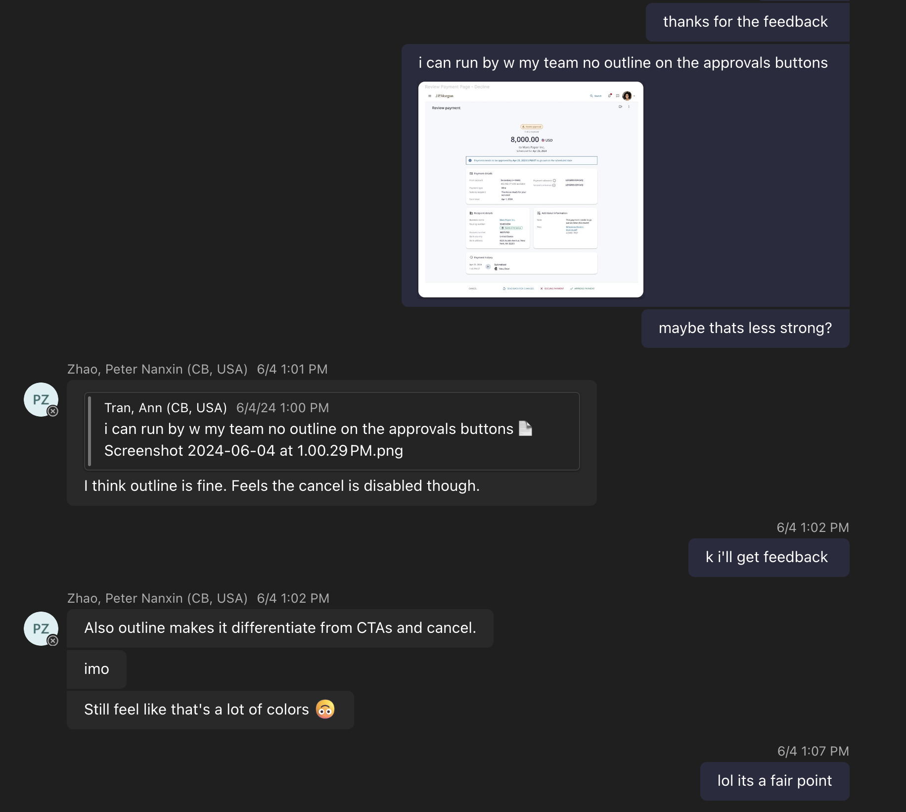
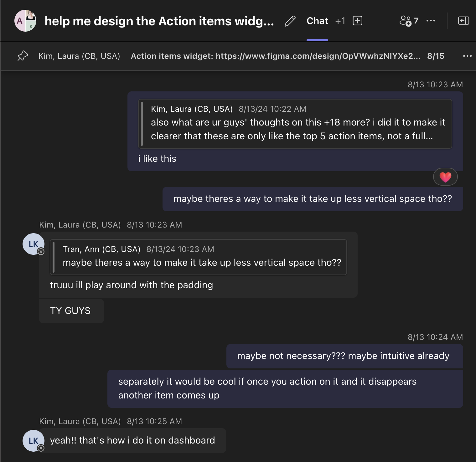
One of the challenges of this work was the continuous collaboration across six design teams responsible for different widget features, different tabs on a consolidated page, or the nascent design system itself. Below are a few examples of the (sometimes chaotic but always valuable!) process of outreach and collaboration. We constantly need to loop ourselves and others in, making sure our experience was consistent, unified and visually streamlined.
On an org level, there was also change. JPMorgan also merged its two divisions: Commercial Banking (CB) with Corporate & Investment Bank (CIB). One design consequence of this merge was converting over 100 designed screens from CB’s Story Design System Library to CIB’s Salt and Pepper Design System Library.
This was a significant effort because many items were not yet built out in Salt and Pepper due to our specific use cases (e.g., approval CTAs, dataviews). We worked closely with the design system designers to clarify which components were on the roadmap, which we wanted to propose to be universal in the design system, and which should be bespoke to our platform.
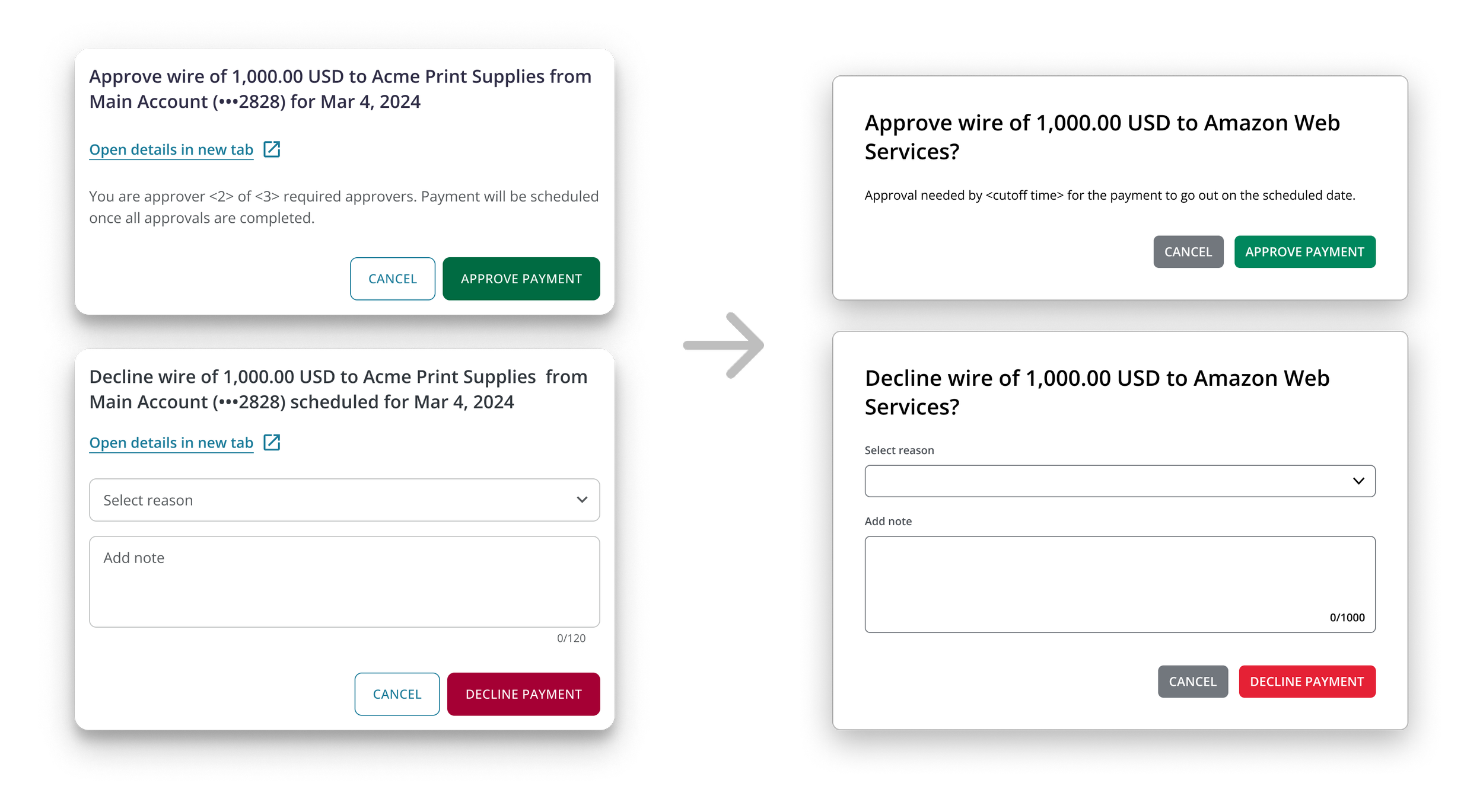
Below is an example of a silver lining to this design system migration. While converting our old designs and looking at things with fresh eyes, we took the opportunity to go back with the content design team and simplify our copy even more.
Outcomes and learnings
Our official launch will be for Fall 2025, so we have yet to arrive to any measurable outcomes. That being said, there have still been meaningful learnings!
First, I helped formalize new patterns absent in the growing design system. In addition to creating new guidelines, I also learned the importance of creating components. If my earlier designs had been componentized, I would have only needed to change them once to update them everywhere.
Second, the back-and-forth on whether or not to include ‘Send back for changes’ as an approval action improved my stakeholder management abilities. Our stakeholder was adamant that it was a useful option, so the design team agreed to keep it in until further testing. Once we received persistent negative feedback, we could come back to our stakeholder and agree to modify the experience without removing the capabilities.
