
Pitching a new digital banking platform for JPMorganChase that received $25M in funding
In March 2023, Silicon Valley Bank entered bankruptcy, the second-largest US bank ever to do so. Following the collapse, almost 50% of SVB-impacted companies, mostly startups, opened accounts and moved their funds to us- America’s largest bank. This presented an enormous opportunity for our team because we were already designing for a new banking experience for startups. Now, we had more reason than ever to supersize this project— all we needed to do was to pitch it.
My role
User research
Product strategy
Product design and implementation
The team
1 product manager
5 designers
1 researcher
8 developers
Year
2023
What’s wrong with our existing Chase platform and what’s right about our competitors’ approach
Together with Tiffany who led research, we built the case that our platform would offer value currently missing from Chase Connect, JPMorgan’s existing middle market banking experience.
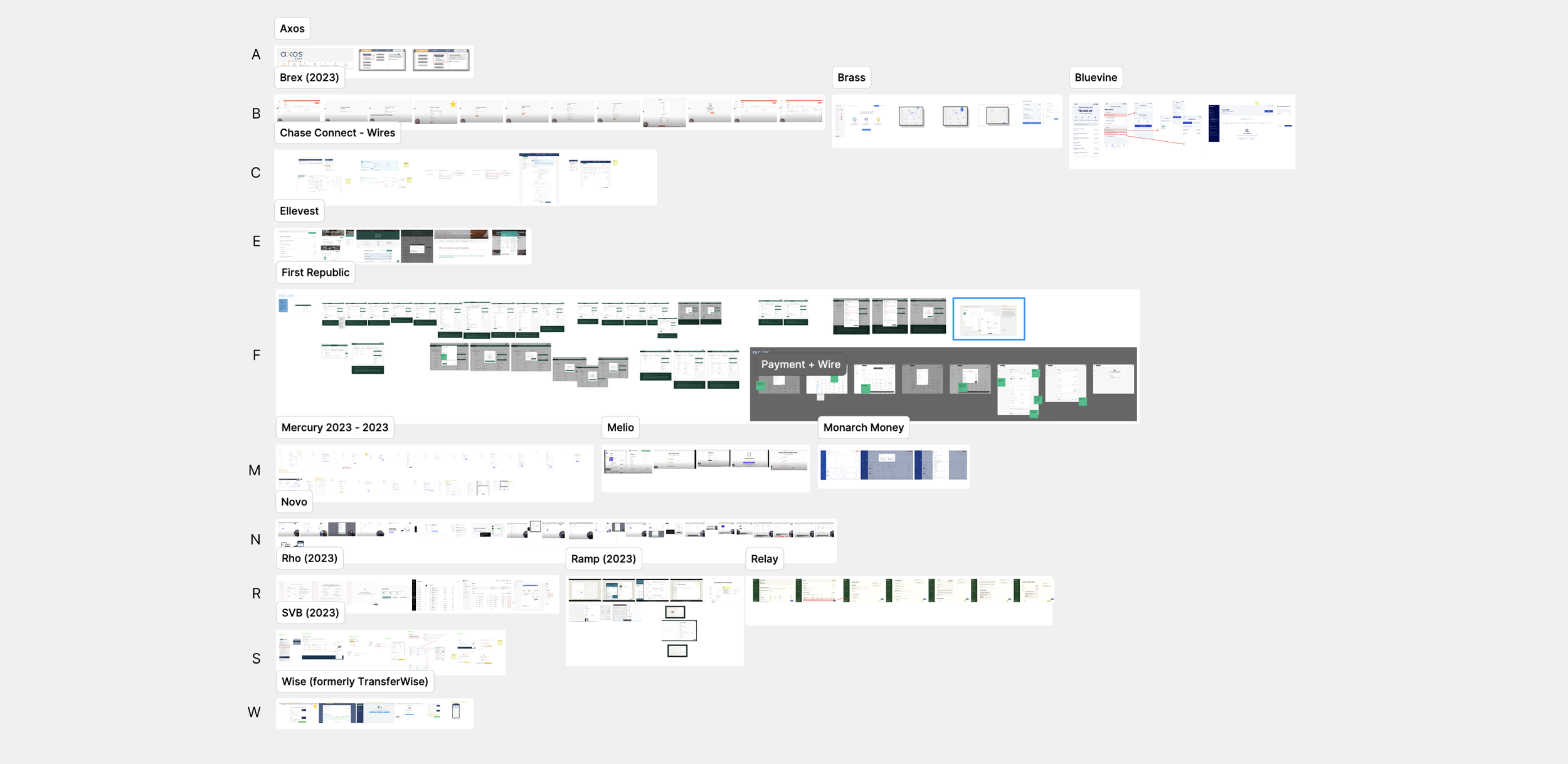
Parallel to design work, Tiffany and I also continued adding to a glossary of competitor experiences to shape design recommendations.
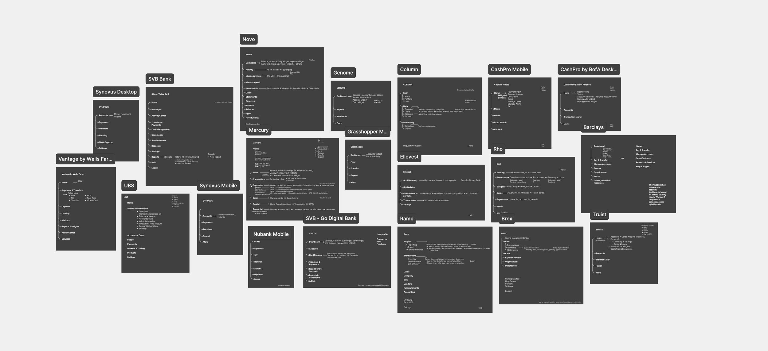
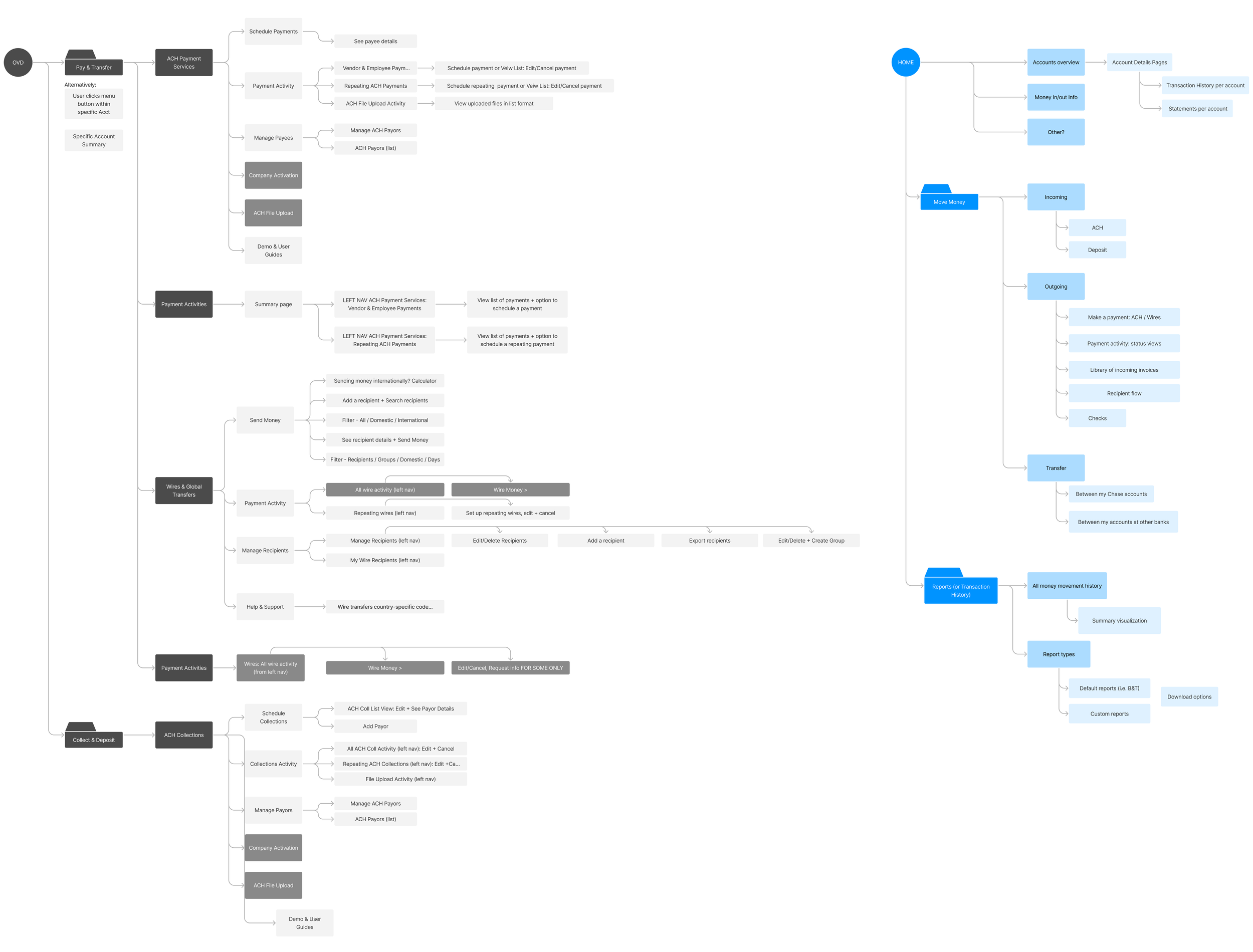
We also mapped competitors’ information architecture to build a case for simplifying what’s in Chase Connect. This alongside our heuristic evaluation shaped our proposal for a simplified accounts, payments, and reporting architecture.
I proposed a simplified information architecture that aligned with our competitors
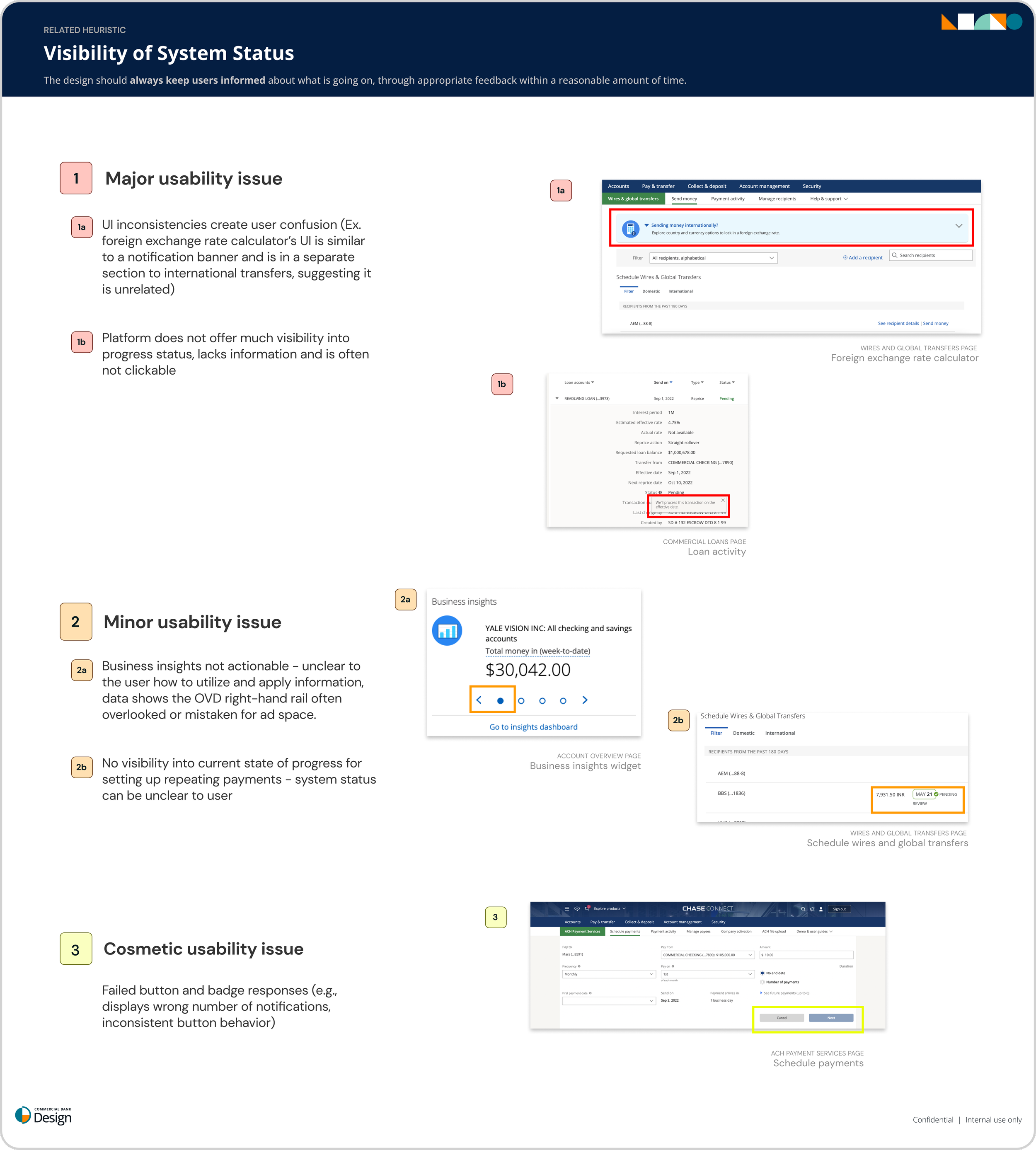
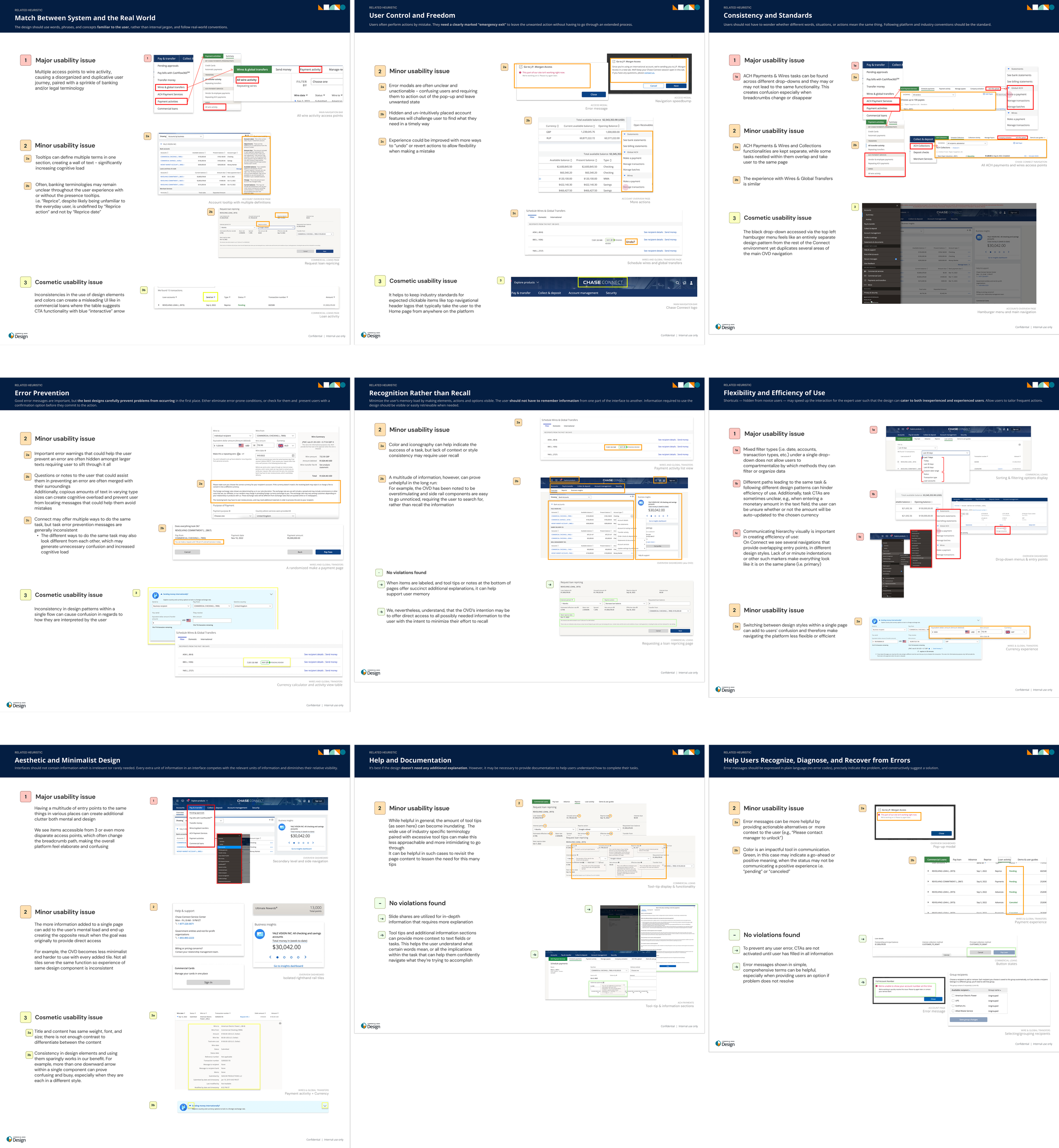
To do so, we performed a heuristic audit on Chase Connect currently across ten heuristic principles.
Reducing entry points allows clients to add features modularly as they grew. Focusing on clarity in our navigation (e.g., from ‘Pay and transfer’ and ‘Collect and deposit’ to ‘Outgoing’ and ‘Incoming’) tailors the experience for startups and non-native bank users. Finally, new groupings helps users limit additional steps or recall from the their end.
On the left was the existing information architecture. On the right was our proposal.
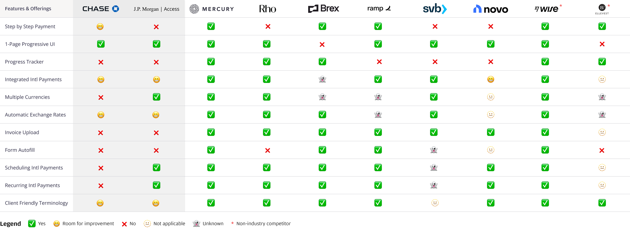
Making competitive research on making a payment easy for stakeholders to understand
Zooming into making a payment, I created a matrix that compares our competitors to our existing platforms. That way, we could easily flag missing features. This design artifact made an impact for our product partners to triage important features.
Speedrunning design and implementation
Finally, the design team collaborated with product and development teams to create a live demo with working code. From viewing all of her account activity and money movement, to making a payment and creating an invoice, to generating reports, Faith could fulfill all of her core banking capabilities.
Make a payment flow
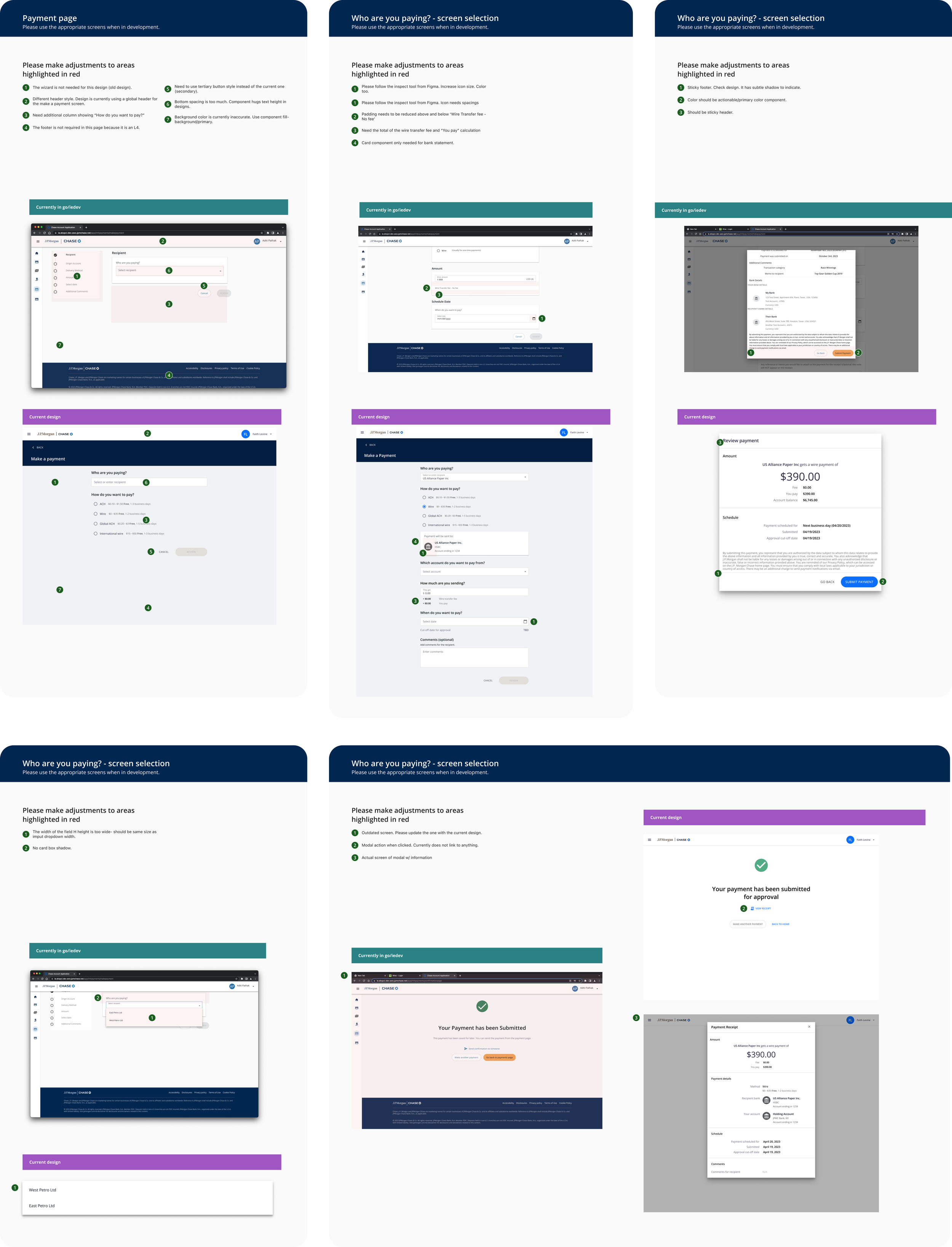
I was responsible for delivering Faith’s happy path to make a payment. While this experience was meant to be paired down, the main feature I wanted to showcase was the progressive display of information (e.g., display only relevant fields based on earlier decisions in the flow) to prevent cognitive overload. These findings are explored further in the Make a payment case study. We offered some, but not all, error states to show at a glance how they might appear.

QA testing with our developers
Once our developers implemented the screens, we performed QA testing in DEV and UAT environments (SIT was not available due to how quickly we stood up the experience). Taking screenshots and annotating them side-by-side with designs, I communicated frequently to developers to initiate, review and resolve UI tickets.
Storyboarding our proposal
In preparation for the pitch, the team created a storyboard to illustrate a new client within the new banking experience. We told the journey through the eyes of our persona Faith, a pre-seed founder. Some of Faith’s key needs include capturing her company’s financials at a glance, understanding banking in simple terms, and streamlining processes to send payments and generate reports.
We follow her as she gets advertised JPMorgan, to setting up her account and traversing the platform.
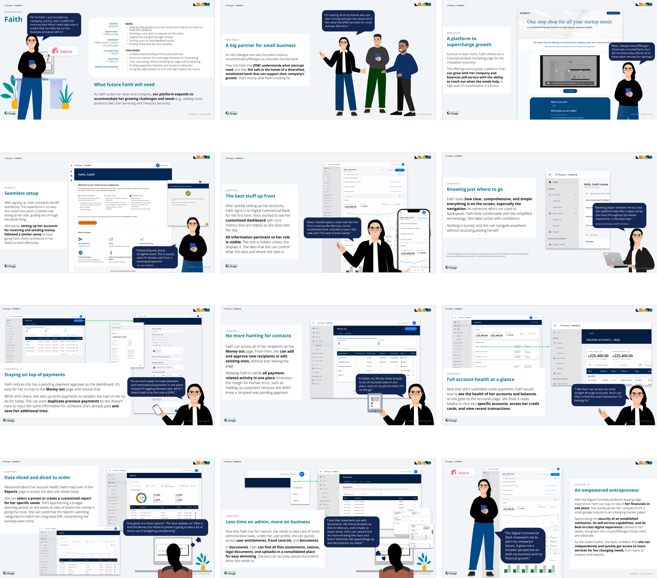
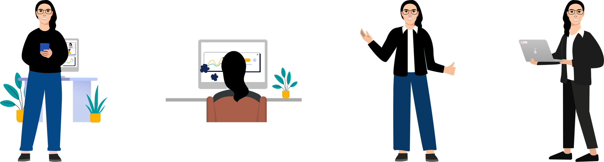
I also contributed new Faith illustrations for the pitch back into the persona library. That way, other teams can use the new Faith’s for their future presentations.
Outcomes and learnings
We received $25M in funding for our proposal across three years, adding an expansion and three years’ worth of business for our team.
This was my first big project at the firm and it taught me early to be okay with imperfection when prioritizing MVP features. Our goal was to ship the idea and inspire our stakeholders— they could fill in the rest for now. It also taught me to work with developers early to minimize rework for later. The sooner we could iterate on UI feedback, the better our end stage would be.
I am so grateful for the opportunity to be a mover and a shaker on one of my earliest projects. Tune into more case studies to see how the our product grew. 📈